
New in IntelliBrand: Sales Performance Dashboard
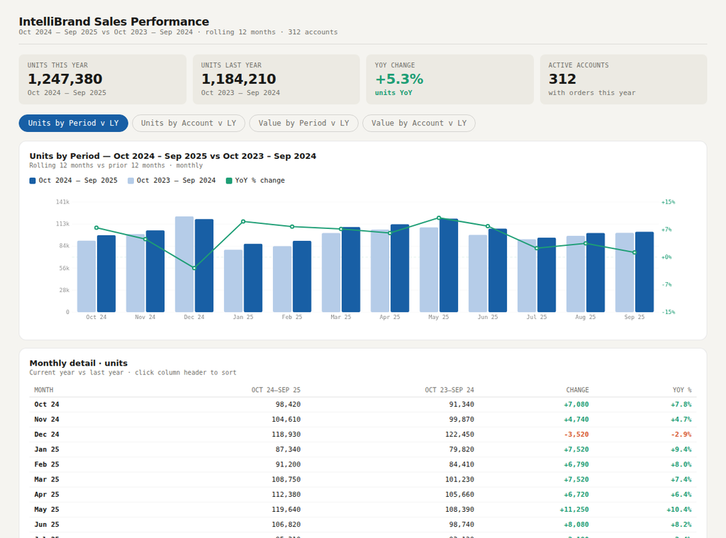
We’ve just released a new Sales Performance Dashboard inside your IntelliBrand console, giving you a clearer picture of how the business is performing against the same period last year.
The dashboard covers four views:
- Units by period vs last year — monthly bar chart of units sold across the current rolling 12 months, compared side by side with the prior 12 months, with a year-on-year percentage change line overlaid
- Units by account vs last year — every account ranked by current year units, with last year alongside and the change highlighted in green or red
- Value by period vs last year — the same monthly view but in revenue terms, so you can see whether value is tracking with volume or diverging
- Value by account vs last year — account-level revenue comparison, searchable and sortable, so you can spot who is growing, who is slipping, and who is new
All four views pull from your live order data and automatically calculate the rolling 12-month windows, so there’s nothing to configure and nothing to refresh manually. The headline KPI strip at the top always shows your current year total, last year total, year-on-year change, and active account count at a glance.
Accessing the Dashboard:
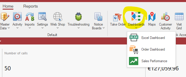
Simply go to Dashboard on your IntelliBrand Console and click on the Sales Performance report. It loads automatically with your live data.
As always, if you have any suggestions on how to improve IntelliBrand, please email us at info@wasptech.com
Also, we would love a rating for InteliBrand in the Play Store . . click link to rate:
https://play.google.com/store/apps/details?id=com.wasptech.intellidroid&hl=en_IE